Components are the building blocks of Forms and Resources. A comprehensive set of tools are available for styling forms and providing input control to suit any aesthetic taste and functional need. When editing a form, the component toolbox can be found on the left hand side of the designer. While anyone can build a basic form in GlobalCapture, it's helpful to understand the full set of Components available to be sure the right component is used for a particular task.
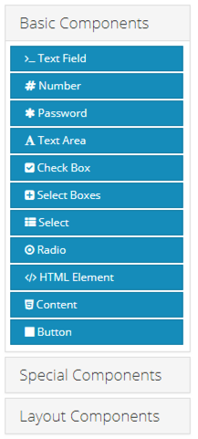
Components are broken down into three sections to help simplify the user experience.
- Basic Components: These are standard input controls that are heavily leveraged in almost all forms. From text input to buttons, you will find Basic Components can fulfill most tasks.
- Special Components: These controls are typically specialized on a specific task. Date entry, signatures, and file upload options are all available here.
- Layout Components: These special controls allow you to control the overall layout of how other components are positioned on a form.