Components are the building blocks of Forms and Resources. A comprehensive set of tools are available for styling forms and providing input control to suit any aesthetic taste and functional need. When editing a form, the component toolbox can be found on the left hand side of the designer. While anyone can build a basic form in GlobalCapture, it's helpful to understand the full set of Components available to be sure the right component is used for a particular task.
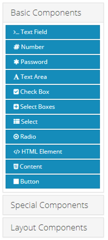
Components are broken down into three sections to help simplify the user experience. The settings for a component will display when it is dropped onto a from. You can also access the settings of a component at any time by hovering the mouse over the component and clicking the gear icon. When working with heavily nested form components, be sure you are clicking on the correct icon.